Well, exactly what’s going on with calculating total factor productivity.
Total factor productivity (TFP) shrunk at 3.9% annualized over Q1 2025. Alex Tabarrok writes “you can see the end of the great stagnation everywhere but in the productivity statistics.”
"What happened in 1971?" update. HT @MargRev pic.twitter.com/on8RfiMpc5
— Marc Andreessen 🇺🇸 (@pmarca) May 25, 2025
This trend is often called “the great stagnation”. Eli Dourado maintains a nice visualization of the divergence from the previous 2% trend, the viral chart above. Tyler Cowen wrote a book about the great stagnation (though he expects it to end soon). Jason Crawford was skeptical at first but came around.
There’s enough discontinuities starting in 1971 to think that something happened: WTF Happened In 1971?. But measuring TFP takes some extra particularities. You can’t count TFPs. You can’t hold TFP in your hand. (You can kinda hold parts of GDP in your hand; by definition, a final good or service!)
But what actual goes in to measuring TFP? I don’t know, and I want to know. So I’m going to dig into that chart.
The chart
There are lots of different data series that aim to measure TFP. Eli prefers this series:
Total factor productivity captures how much output can be produced with a diverse but fixed basket of inputs. As technology and institutions improve, TFP goes up. As they deteriorate, it goes down. In the last decade, TFP has deeply stagnated.
While there are numerous estimates of total factor productivity in the US, only the series maintained by the Federal Reserve Bank of San Francisco is quarterly and attempts to adjust for the business cycle.
The Federal Reserve Bank of San Francisco (FRBSF) actually crunches the numbers, which you can read about here. You can also download the numbers for Eli’s chart, but everything’s in annualized percentage changes (The FRBSF could be getting retweeted by Marc Andreesen. Look how much alpha there is in just making the actual chart!)
Note that this is the “utilization-adusted” TFP series, which adjusts for more than just seasonality:
This site presents a real-time, quarterly series on total factor productivity (TFP) for the U.S. business sector, adjusted for variations in factor utilization – labor effort and capital’s workweek. The utilization adjustments follows Basu, Fernald, and Kimball (BFK, 2006). Using relative prices and input-output information, the series is also decomposed into separate TFP and utilization-adjusted TFP series for equipment investment (including consumer durables) and “consumption” (defined as business output less equipment and consumer durables).
Labor includes an adjustment for “quality” or composition. Capital services are also adjusted for changes in composition over time (e.g. computers, other equipment, structures, and inventories).
— FRBSF
Also note that this paper and methodology focuses exclusively on the business sector. This way of breaking down GDP excludes gross value added from Government and from Households — still representing ~80% of GDP. (In other ways of calculating GDP, government spending is a larger share).
The formula
TFP as a concept is trying to capture an “everything else” concept. What drives growth other than labor and capital? How well you use those inputs. That’s TFP. It’s like a weighted-average productivity across all of the inputs in an economy.
When economists want to measure a theoretical variable, they take it in three steps:
- Define a model (for the economy, industry, or firm)
- Solve math problems to isolate the variable to measure (on the left-hand side of the equation)
- Find data that approximates each remaining variable (on the right-hand side of the equation) This isn’t some sort of alchemy — it’s just about having a well-reasoned argument behind why you’re choosing certain data over others to estimate a theoretical variable.
John Fernald’s working paper defines the methodology behind Eli’s chart:
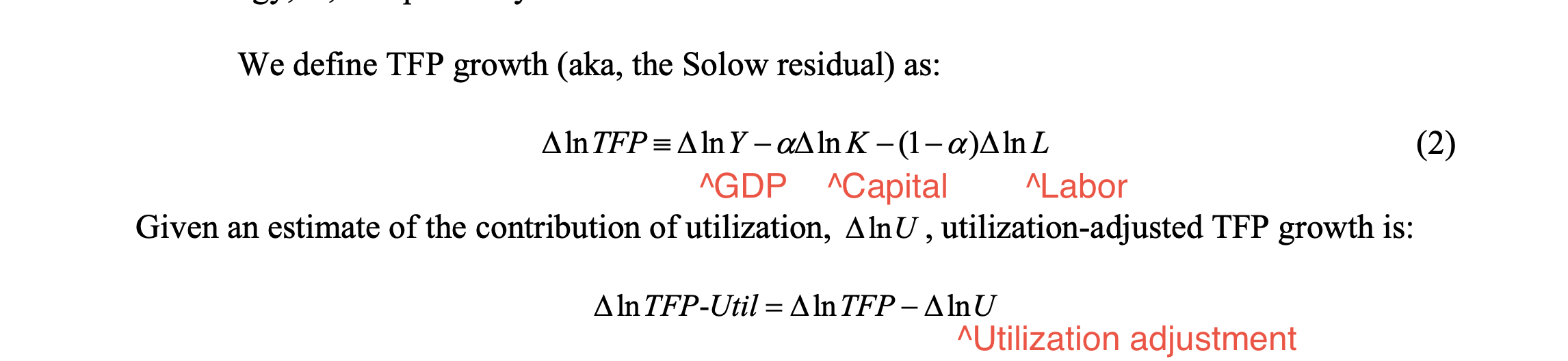
Fernald does the math to get here, but also this formula makes intuitive sense. One way to measure TFP is to measure changes. Measure the percentage change in output, and then subtract how much of the change is because of changes in labor, changes in capital, or changes in utilization. What’s left is (percentage change in) TFP! (Note this is why the chart doesn’t have a “unit” — the y-axis is just defined as change since an index year. TFP does sort of have a unit ($ per factor), but it’s much easier to measure this way).
Sidebar: The reason this “percentage change” technique works mathematically is that the economy is modeled with a Cobb-Douglas function (at its simplest, Y = K^alpha * Y^(1-alpha)). There’s other models, but Cobb-Douglas is reasonable: The constraint is that to double output you have to double both labor and capital (but for productivity growth!)
The components
OK but these are still theory-defined concepts. How are the parts of the formula actually measured?
Anyone can download the spreadsheet! The formula we’re working with is:
dtfp_util = dY - alpha*dk - (1-alpha)*dL - dutil
- dY — change in output — is the average of two data series that measure business output, one estimating output from the “expenditure side” and one from the “income side”. I assume this is to smooth out measurement differences. Both series are calculated by Fernald using data from the National Income and Product Accounts (NIPA) tables published by the Bureau of Economic Analysis (BEA). It’s using tables 1.3.5 and 1.3.6 here: BEA Interactive Data Application
- alpha — capital’s share of income — is based on Fernald’s calculation, also using the same NIPA tables.
- dk — capital input — is also calculated using data from NIPA (tables 5.3.5, 5.3.6, 5.7.5B, and 5.7.6B), basically a weighted change across 15 kinds of capital stocks that are measured in the BEA data.
- dL — labor input — is a bit more complicated. It’s actually dL = dhours + dLQ, where LQ is a labor composition / labor quality measure.
- dhours is business-sector hours, a quarterly series direct from the Bureau of Labor Statistics (BLS), available here: Schedule of Releases and Revisions for Productivity Program : U.S. Bureau of Labor Statistics
- dLQ is based on one series & methodology through 1978, and a different series & methodology starting in 1979. The pre-1979 series uses older BLS data. The post-1979 series uses quarterly data from the Current Population Survey to basically create a weighted average of labor quality. Fernald says Bart Hobijn and Joyce Kwok maintain these estimates but I can’t seem to find more details on that.
- dutil — change in utilization — is… a lot of math. It looks like the primary dataset is BLS data on hours per worker by industry — that’s the same Productivity and Costs releases. And then there’s a bunch of weights and assumptions and math to get to an overall weighted average.
So in short, there’s four components built from about six data series (with a lot of math) that are drawing on data from the BEA, BLS, and CPS.
Fernald maintains a great data table with all of these underlying components. How have these four components changed over time?
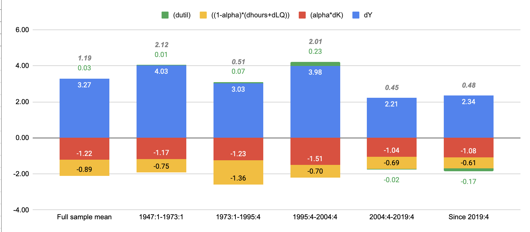 My chart, combining the average changes for alpha and capital input; alpha, hours, and labor quality.
TFP growth was around ~2% per year in the 1947 to 1973 period, and again in the 1995-2004 period. The “great stagnation” is the other periods, when we’ve been averaging more ~0.5% per year.
Mostly it’s about less growth in output. Capital input, labor input, and utilization are pretty similar on average throughout each period. A different way that TFP could be near zero change is if output is growing, but capital input and labor input are way up, so that TFP is flat. However, it makes sense that that sort of “boom town” effect would smooth out over periods of decades.
The utilization adjustment, while important, also doesn’t make too much of a difference. It’s obviously not low utilization that’s holding TFP back on average.
Plotting out the annual values, though, shows that there’s a lot more variance in these components year to year.
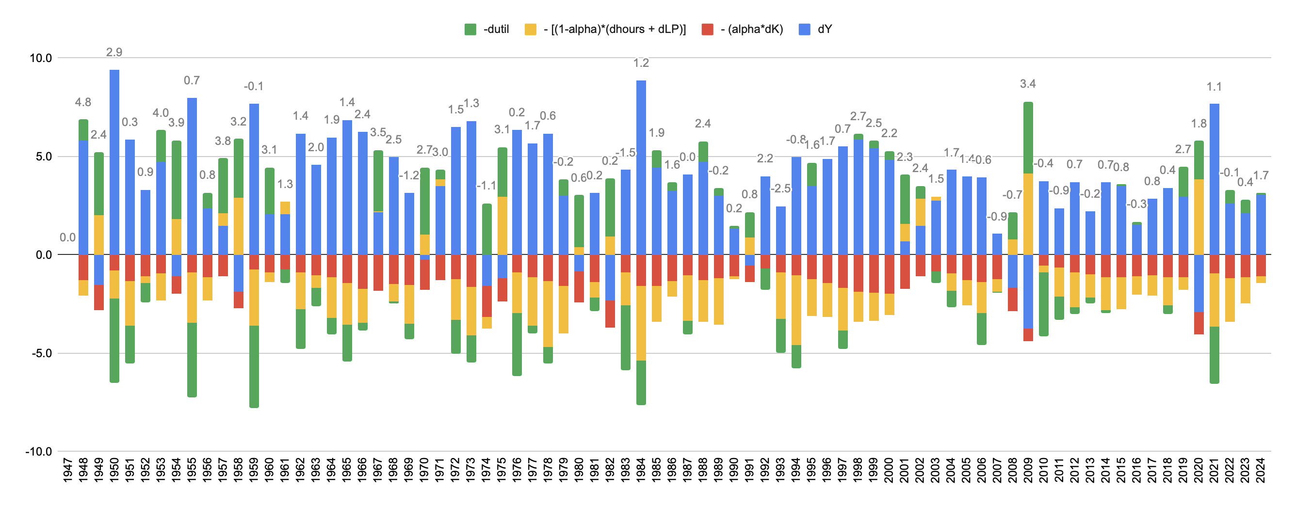
I think on one hand, this makes sense. During a recession, output goes down. But TFP might not go down, instead you would expect to see hours worked go down, utilization go down, and capital input to go down. Sure you might get less productive in some sectors, but mostly you’re cancelling shifts and turning off the machines. Sure enough, in years like 2009 and 2020 that’s what we see.
On the other hand, this way of measuring TFP is stacking a lot of math and assumptions on top of multiple surveys… exposing the measure to multiple sources of error / changes in underlying trends. But, it’s hard to measure productivity!
The surveys
How do economists come up with these numbers anyway? This TFP measure mostly uses data from three sources:
- BEA’s NIPA tables
- BLS’s Productivity and Costs releases
- Census Bureau’s CPS
NIPA, since it’s measuring GDP, basically uses a ton of different surveys. From the NIPA Handbook:
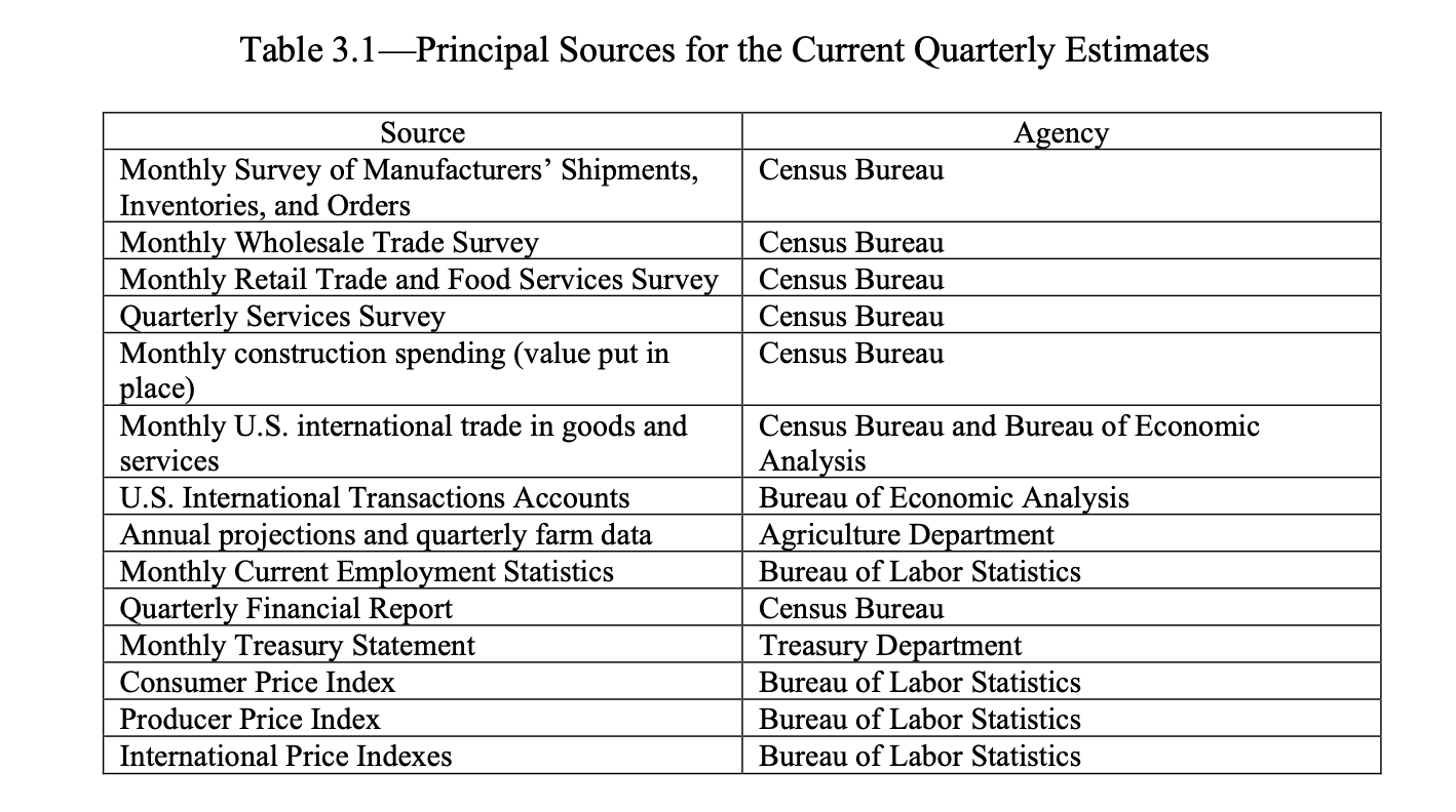
The Census Bureau administers more than 60 business surveys every year. Unlike for households, participation is mandatory in many of the business surveys by federal law (About Business Surveys). Most surveys don’t include every single business of course. ChatGPT says most of the business surveys are done electronically now a days, and even some direct data exchange for large companies with frequent reporting.
Productivity and Costs’ data on hours worked are primarily from the BLS Current Employment Statistics (CES) program. It’s supplemented with the BLS Hours at Work survey (to subtract paid time off) and the CPS (to add off-the-clock hours) (bls.gov/news.release/pdf/prod2.pdf). The CES “surveys approximately 121,000 businesses and government agencies, representing approximately 631,000 individual worksites” every month. (Current Employment Statistics - CES (National) : U.S. Bureau of Labor Statistics). Responses come from computer-assisted telephone interviews for the first 5 months, and then respondents can choose another way to respond (90% respond via electronic data interface or online - CES Frequently Asked Questions). Firms are in the sample for at least 2 years (bls.gov/opub/hom/pdf/ces-20110307.pdf).
The CPS is a monthly survey administered by the Census Bureau. There are about 60,000 households in the sample at any time, and households in the sample are surveyed in two periods over a 16 month period (in for 4, out for 8, in for 4). The CPS is administered through interviews by Census Bureau employees, both in-person and over the phone by Census Bureau. (Methodology).
So in practice, this TFP measure ends up using a lot of the economic surveys. Even though CES and CPS are more narrowly scoped, the NIPA tables end up aggregating a ton of other survyes.
Comparing to the BLS measure
The BLS also publishes a TFP measure (Private Business Sector: Total Factor Productivity (MFPPBS) | FRED | St. Louis Fed) — the major differences vs. Fernald’s measure is that the BLS measure is annual, not quarterly, and it doesn’t adjust for utilization (implicitly, for the business cycle).
Fernald shows that his quarterly TFP series (without the utilization adjustment) is highly correlated with the BLS measure (0.97):
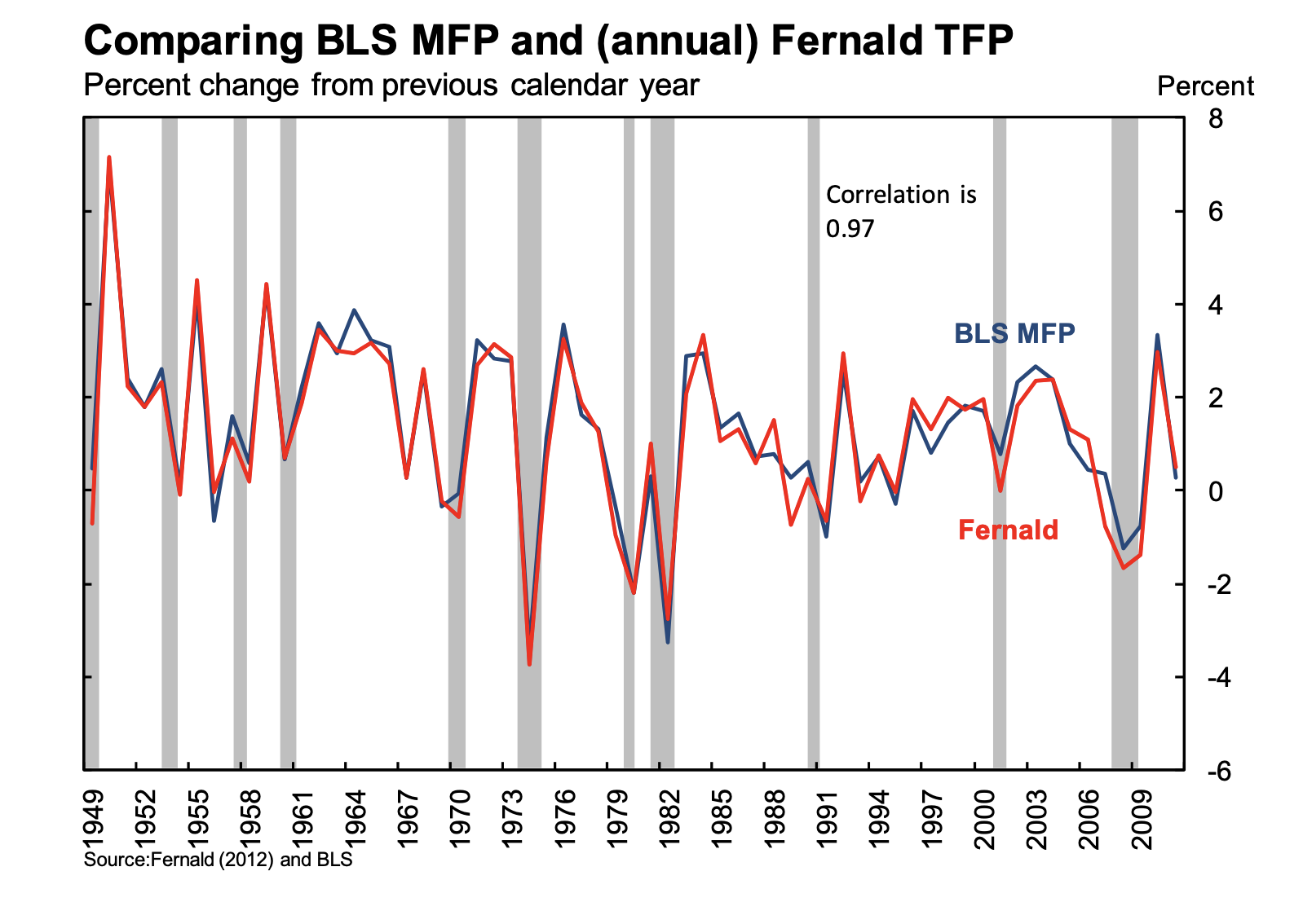
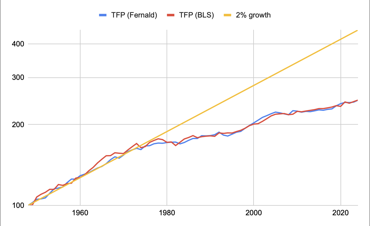
How does the BLS measure compare to Fernald’s adjusted measure? Overlaying the annual version of Fernald’s series, we see it’s again not far off. So adjusting for the business cycle is more important for comparing year-over-year and quarter-over-quarter changes, and for understanding what changes are going on. But averaging over decades, TFP ends up in the same place. (That’s great! That’s what should be happening).
Is this even a good idea?
The productivity statistics continue to be awful, contra Alex Tabarrok part of this recent -3.88% Q1 print is presumably imports anticipating tariffs driving down measured GDP and thus productivity. The more I wonder what’s wrong with the productivity statistics the more I think they’re just a terrible measure of productivity?
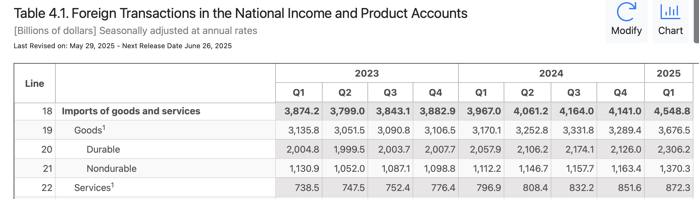
n.b. I think Zvi is wrong about imports here. The underlying business surveys ask about imports and inventory. An increase in imports in one survey should also show up as inventory in a different survey (as capital) which cancels out. I suppose there might be a time lag between when imports show up in a survey (as $ out the door to place an order) and when inventory shows up in a different survey (goods in a warehouse) — average shipping time from China to US for sea freight is 20 to 40 days (A Breakdown of China to USA Shipping Time — Dimerco), and a quarter is ~90 days… So most of that timing effect will be moot. Also, liberation day was in Q2.
That said there is about a 10% jump QoQ in imports in the BEA data in Q1 2025:
That aside: “The more I wonder what’s wrong with the productivity statistics the more I think they’re just a terrible measure of productivity?” is a fair question.
But the productivity statistics mostly change due to changes in GDP. So it’s really a bone to pick with how we measure GDP. Which brings you back to the regular old arguments about GDP, like that the measures don’t account for consumer surplus from the internet or Wikipedia. Or that it doesn’t account for increasing quality of like-products over time.
The productivity statistics (and those who measure them) are doing their best! Whatever’s going on with TFP stagnation, it’s either real or it has to do with how we measure output.